Wednesday, May 26, 2010
Come visit my new BlogginGestaltDesign web site.
BlogginGestaltDesign has a new home, http://BlogginGestaltDesign.com/. This is a site I designed in WordPress (an open source, content management system often used as a blog publishing application). Take it for a spin and tell me how you like it, the good, the bad and the ugly.
Thursday, November 12, 2009
Finding smiles and Gestalt in everyday items.
So, where the heck have I been? I'm sorry it's been so long since my last blog post, but as of August I'm now a grad student getting my Masters Degree in interactive design. I also teach two classes at The S.I. Newhouse School of Public Communications at Syracuse University and this fall I designed a brand new niche magazine for the Central New York region called Central New York Sports Magazine. Oh yeah and I have a family that never sees me anymore. Good thing they love me.
So what's new on the Gestalt front?I keep on seeing, time and time again, TV commercials using figure/ground ambiguity as their main visuals. Why? To grab the attention of the viewer.
Figure/ground: An image (figure) is separated from its surroundings (ground). This is how contrast in a design is created. When the figure and the ground become ambiguous, it can create an interesting image.
I think that this American Express Commercial does this so well. I'm a big fan of simple design and this commercial succeeds on all levels. They don't hit you over the head with the visuals, but the use of figure/ground makes you stop in your tracks and watch the commercial to see just how many everyday objects they find that have a happy or sad face. Isn't this the goal of any advertisement? To get and keep your attention and not have you change the channel or get up for a bathroom break.
Gestalt saves the day!
Tuesday, July 28, 2009
Yes, even hamsters can teach you something about Gestalt.
I saw this magazine ad for the Kia Soul, and I realized that Gestalt works on motion (video) as it does in print design.

The print ad is a wonderful example of the Gestalt principle of similarity. Similarity is when items are perceived as being related because they have a similar shape, color, size, etc. This is actually an example of the inverse of similarity, where everything is the same and this makes the odd item stand out amid the others. That’s what makes the hamsters in the red Kia Soul stand out among the hamsters in the wheels.
This made me start thinking about the Kia Soul Hamster TV ad, and how they use the same inverse of similarity. Notice how everything in this ad is a very muted color allowing you to focus on the red Kia Soul.
Who knew dancing hamsters could be so interesting?
Tuesday, July 14, 2009
Make your mark memorable with Gestalt
When looking at logos why do so many use figure/ground ambiguity?
I was creating a Gestalt lecture this week for my students and I noticed that when I got to the principle of figure/ground, instead of finding examples of how the content was designed like news and magazine pages, advertisements, and web site designs, I was finding examples of the visuals like logos and illustrations. This got me thinking...
To start I need to explain the Gestalt principle of figure/ground. An image (figure) is separated from its surroundings (ground). This is how contrast is created in a design. The more you separate the image from its surroundings, the more contrast is being created.
When the figure and the ground become ambiguous, meaning figure and ground become hard to differentiate, it can create an interesting image. It’s this ambiguity we will explore.
So why was I finding more logo and illustration examples instead of design examples?
I believe it is because when an image is ambiguous it makes us pause. You are more likely to stop, look more closely and try to figure out what you are looking at. This is what an illustration needs to do so that the reader stops to read an article or advertisement.

This goal becomes even greater when designing logos. You want the consumer to stop and imprint that image on their brain. Probably the best way to illustrate this point is to take a look at some successful examples that use figure/ground ambiguity.
![]()
Many people don't see the hidden arrow between the "E" and the "x" in the FedEx logo.

Their are eleven teams in the Big 10.


Food writers logo


Knight Transportation logo, I actually called my wife to tell her about this logo while I was on the road as the logo passed me on a tractor-trailer. She was not nearly as interested as she should have been. I don't understand it?


Wednesday, July 1, 2009
Gestalt grabs me in the eye doctor’s office.
 I know it’s been a little time since my first post, as Charles Apple commented on in his blog. But it’s been a bit hectic over the past week or so because of my recent career change.
Last week I was sitting in the eye doctor’s office as my daughter was reading off the eye chart. I was scanning the office, basically because I was bored. Things went though my head like, “why does one eye chart use slab-serif type and others use san-serif?” I’m sure people all over have thoughts like these on a daily basis.
Then a brochure about contact lenses called “synergeyes” grabbed my attention. Looking at the logo at first I couldn’t wrap my head around what I was seeing. Was that a brush stroke, or an eyebrow? But there’s no pupil. Intriguing!
This is the principle of closure, where your brain fills in images that aren’t really there. This is a great principle to use when you are creating an identity for an organization because it has the effect, as it did on me, to force the person looking at the image to figure out the images and their meaning. In a world of logos vying for attention this principle can give you a leg up on the competition.
Other principles being used on the logo are proximity, all the letters and the eyebrow being close to one another, creating a unit. Then there is similarity, “synerg” is displayed in a light san serif font and “eyes” are in a bold san serif font. This breaks the two words apart even though all the letters are the same distance apart from one another.
On the brochure, the similarity of the purple color brings your eyes down the design to the logo. This way of directing your eye down the page is the principle of continuation. More on that one another time…
Thursday, June 18, 2009
New Pepsi logo goes back to the future
Putting this first blog on the page is like facing a white canvas and having a hard time putting the first brush stoke on it for fear of screwing it all up.
I’ve decided to go with the biggest brand change in the last year, the new Pepsi logo.
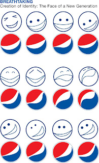 Some Gestalt principles that are in play in the logo are the proximity to the two shapes near one another, thus creating a single image. There is also the use of closure, where the circle is completed even though the circle is incomplete. Your brain puts eyes on the logo when there are none, this is also closure. As you can see this was the intent of those who created the new logo. Here is a slide from the presentation titled “Breathtaking” accompanying the redesign of the Pepsi logo by Arnell Group.
But the most important principle working for the logo is isomorphic correspondence. Putting your own history to pictures or images you see.
When looking at this logo is the updated brand readily apparent? Maybe. When I see that smiling logo it brings me back to my childhood. There is some nostalgia when I see a can of Pepsi with the new logo, because that logo reminds me of a modernized “have a nice day” smiley face. Popular in the 70’s and used by Wal-Mart more recently. Is this their intent or is it just a coincidence? If you think about it smiles are a constant in marketing because when something is smiling at you, you smile back. It also says you are interested and it strengthens the bond between you and the customer. Think about the smiley face at Wal-Mart. “Have a Coke and a Smile.” the Amazon.com logo.

Remember, “Smile and the World Smiles with You” … advertisers know this better than anyone.
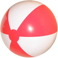
Maybe it’s just me that sees the have a nice day smiley face in the new Pepsi logo. My wife, who is somewhat graphically challenged, sees a beach ball… That’s what isomorphic correspondence is all about, bring your own personal history to what you see every day.
I’ve decided to go with the biggest brand change in the last year, the new Pepsi logo.
 Some Gestalt principles that are in play in the logo are the proximity to the two shapes near one another, thus creating a single image. There is also the use of closure, where the circle is completed even though the circle is incomplete. Your brain puts eyes on the logo when there are none, this is also closure. As you can see this was the intent of those who created the new logo. Here is a slide from the presentation titled “Breathtaking” accompanying the redesign of the Pepsi logo by Arnell Group.
But the most important principle working for the logo is isomorphic correspondence. Putting your own history to pictures or images you see.
When looking at this logo is the updated brand readily apparent? Maybe. When I see that smiling logo it brings me back to my childhood. There is some nostalgia when I see a can of Pepsi with the new logo, because that logo reminds me of a modernized “have a nice day” smiley face. Popular in the 70’s and used by Wal-Mart more recently. Is this their intent or is it just a coincidence? If you think about it smiles are a constant in marketing because when something is smiling at you, you smile back. It also says you are interested and it strengthens the bond between you and the customer. Think about the smiley face at Wal-Mart. “Have a Coke and a Smile.” the Amazon.com logo.
PepsiCo Chairman-CEO Indra Nooyi knows this as well, characterizing the revamp of the brand as “how they connect with consumers.”
Remember, “Smile and the World Smiles with You” … advertisers know this better than anyone.
Maybe it’s just me that sees the have a nice day smiley face in the new Pepsi logo. My wife, who is somewhat graphically challenged, sees a beach ball… That’s what isomorphic correspondence is all about, bring your own personal history to what you see every day.
Subscribe to:
Posts (Atom)